

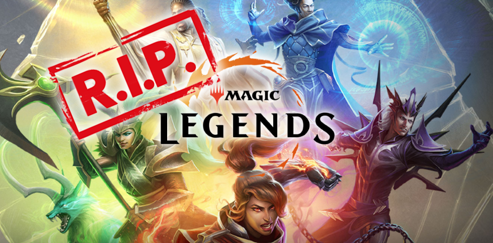
The game that was Magic Legends has itself passed into legend.
With servers shutting now shut down and the game unplayable, it's worth looking back at what went wrong and dream of what might have been. There were a wide range of reasons for the game’s cancellation, many pointed to performance issues and a problematic in-game store, but there were gameplay and UI issues as well.
Looking purely at the gameplay experience this was an interesting new take on an old genre, but it just missed the mark in a few ways.
UX Breakdown
-
Mixing the gameplay and action bar of an ARPG with card game mechanics and randomness creates a large number of usability issues. The system itself is unique and interesting, taking the standard ARPG action bar and replacing it with a random card mechanic like Magic itself is novel, but the implementation makes it difficult to use, forcing players to spend too much time looking at the bar and not at what is going on in the fight sequences.
The symbols at the top of the cards are too small to be useful during chaotic fights. There are three different types of cards: Creature, Sorcery, and Enchantments. This should be easy enough to grok, but the size of the symbols makes this difficult in the middle of a fight. The card art unfortunately doesn’t help either. Viewed at full size when deck building, the art is fantastic, but at the small size of the cards it can be very difficult to tell cards apart since they will all be using the same color palette (until players unlock the ability to build decks using two colors).
Other Diablo-style ARPG’s are prone to similar issues with legibility of the ability bar iconography and art, but this generally isn't an issue due to their static nature. In Diablo 3 or Path of Exile, once a skill is set to the ability bar it remains in that same spot until the player changes it. In Magic Legends, due to the card game mechanics, players don’t know where an ability will be bound moment to moment. Creature Spell A could be bound to the “1” on a keyboard or “X” button on a controller, but after it is used and shuffled back into the deck, the next time it appears it might come back as “4” on a keyboard or “B” on a controller. In this system, card legibility is super important, otherwise players will be constantly second guessing themselves and squinting at the ability bar instead of going into the flow state common in other ARPG’s.
Additionally, the card game mechanics are implemented in a way that removes interesting decision points. Players can build a deck of up to 14 cards, but only 4 are available at any moment. During gameplay, players don’t know which cards will come next in the queue (which is a standard mechanic in card games), but instead of following the standard of other card games using a draw and discard pile, it appears the game uses a weighted random number generating system to determine what new ability from the "deck" is added to a newly vacant slot. With no way of knowing when a powerful ability will come up, this leads to players using abilities they don’t want to just to cycle through cards hoping the ability they want comes up, removing an important skill component from both the ARPG and card game sides of the game and reducing the potential for meaningful choices during fights.
-
Summoning creatures or people to fight alongside the player is a key component of the game, and Magic in general, but the placement and size of their icons make them difficult to check during a fight. Either the player doesn't look at them because they are focused on the rotating abilities of the action bar, or have to look far from the action bar causing them to miss the changes there. Making informed decisions about abilities that buff or heal summons is difficult when the icons are small and out of the way.
-
Unlike other ARPG’s that use a fixed, isometric camera, Magic Legends' camera can be rotated, binding this to the right button on a mouse or the right stick on a controller. This creates several problems. The genre is known for chaotic fights with a lot happening on the screen at once, which Magic Legends already dials up to 11 with its card mechanics, but now the camera can be obscured behind objects in the level and the player is responsible for rotating it, adding to the chaos and frustration of its fights. This also removes the right mouse button or right stick as a control for other abilities, which is common in the genre.
-
Player character models have a small spatial UI element that sits below them to indicate their position and general facing to the player. During large fights this becomes difficult to see. This is a common issue across many ARPG's, it is not unique to Magic Legends, but it is exacerbated here by the card system and focusing so closely on the action bar. It's difficult to take a quick glance to determine the player's facing before using an ability.
UI Redesign
Before getting into UI changes, I would recommend switching to a fixed, isometric view camera. Focusing on the innovations to the ARPG genre should be the focus, and players shouldn't have to also contend with managing the camera. This would potentially mean additional work for the level design team, but it appears that adding the standard isometric camera feature of terrain cutting away/disappearing when it is in the way would work with the existing levels. This change alone makes a huge difference to the player experience, letting them focus on the interesting game mechanics, and even thinking about the camera.
A word on my process: I spent time sketching various changes to the UI, but kept a few things in mind. First, I wanted to keep the core concept of the game as unchanged as possible. Melding together a card game/deck builder with an ARPG is a novel concept, keeping that at the core of the game design is essential. With that in mind, the card mechanics will always add more randomness to a chaotic game so reducing the time it takes a player to absorb information is important. With abilities rotating in and out of the action bar, it needs to be extremely legible. The player should be able to, at a glance, know what is there and make informed decisions. Finally, there are a lot of cool spell effects, monsters, and level design here, but they are completely missed by staring at the action bar. With the card mechanics, it's too much to ask the player to look all over the screen for information, but if the UI is tightened up a bit the player can get information in a few places while still looking around the screen.
-
The action bar causes the biggest concern and therefore needs the biggest changes. With legibility being at the forefront, it will require more screen space. I sketched various ways to handle the health bar, and eventually decided to place it at the top of the screen. This goes against ARPG conventions, but does a number of things for the UI. It frees up real estate for the action bar. It gets the eye to move around the screen a bit, but keeping it larger and in a vertical line from the action bar lets players quickly glance up to check their health. I would include some visual indicators in the UI when the character reaches a low health state as an indicator to the player.
-
The ability bar is the focal point of the UI, so it receives a larger overhaul. The increased random nature of card mechanics brought into the chaotic battles of the ARPG genre, where a misusing an ability can make or break difficult end game fights, needs to be accounted for. Players need to be able to quickly understand what abilities are on their bar and in which keybind slot.
With the health bar moved out, I was able to increase the size of the action bar. It now takes up the middle third of the screen, regardless of screen size. This allowed for larger ability cards. With the additional space on the ability cards I increased the art size, making the images more legible. I would also recommend a little more variation in color palette to the art team in order to distinguish abilities. This also created space for the ability name to be added to the card. In the middle of a fight the player won't want to read the whole text, but even just seeing the first few letters of an ability name is enough to serve as another visual cue. On mouse and keyboard, cards can be hovered over with the cursor for tool tip explanations of what the ability does.
-
Using a weighted random number generator to determine which ability from the "deck" replaces a used ability was a mistake. This implementation represented neither the card game nor the ARPG side of Magic Legends well. I would recommend more closely mirroring actual Magic: The Gathering gameplay using draw and discard piles. Players know how many cards remain to be drawn before the deck is “shuffled,” or know how long until a powerful ability has the chance of coming back around. As players improve, remembering which ones have been used becomes a skill, this creates interesting decision points for the player about when to use an ability, unlike the current system which encourages them to use unwanted abilities in an attempt to shuffle through in hopes of getting a better ability.
-
Move the summoned creature icons to the top of the screen nearer the health bar, and increase their size considerably. Moving them closer to other important UI elements and increasing size makes them more legible at a glance, which allows the player to make more informed decisions about healing or buffing them mid-fight. This still leaves space for 6 creature portraits in a single line, which should be the maximum a player can summon at any given time.
-
Finally, solve for a common ARPG problem. The player indicator's design remains largely the same but with a small darkening effect inside the circle to make it pop from the background a bit more, increasing its visibility. I would also recommend testing it sitting in front of any game objects like enemies and terrain, or changing to a different style when behind another game object to increase its visibility in chaotic situations.
Current UI
Redesigned UI
Current Player Indicator
Redesigned Player Indicator